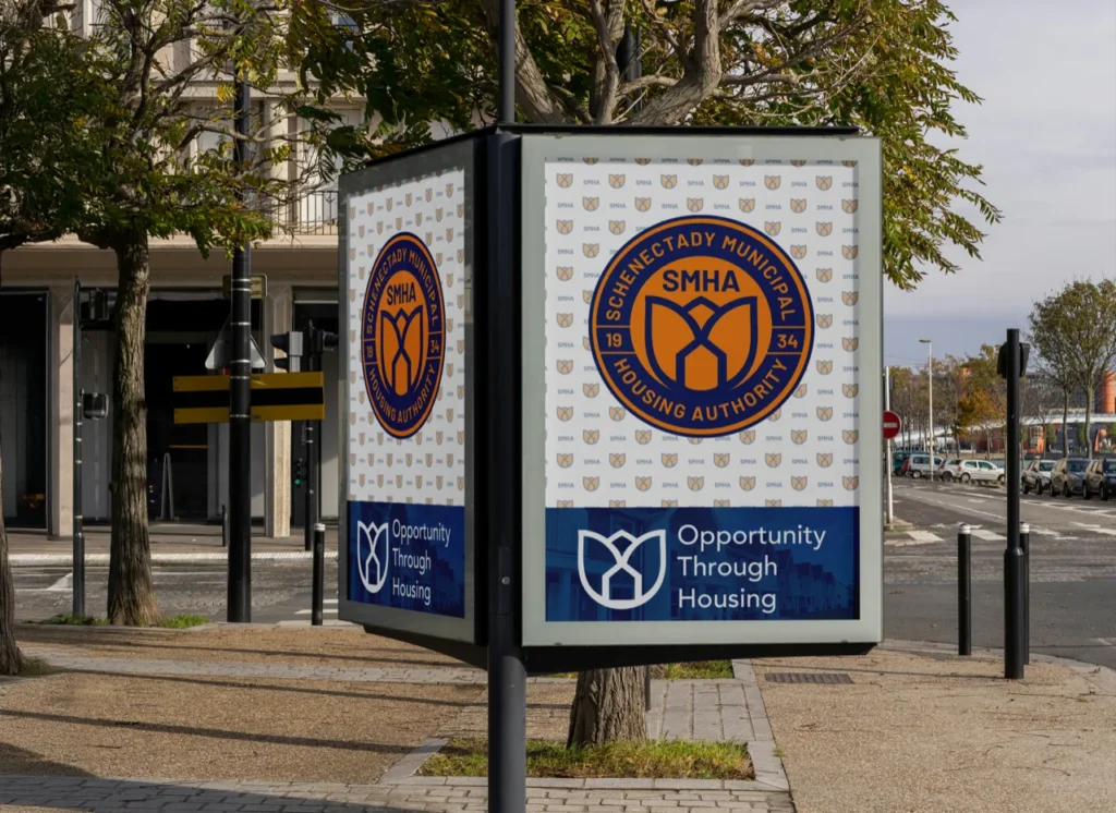
Schenectady Municipal Housing Authority
From a name on a building to a brand the city can stand behind.

RJD Remodeling does the kind of work homeowners love to show off: kitchens, baths and everything in between.
We gave the company a mark as precise as its craftsmanship, built from the tool every remodeler reaches for first.

Three initials are easy to say and hard to remember.
In a market full of contractors with similar names and similar trucks, homeowners remembered the kitchen but not who built it. Referrals got lost between one neighbor and the next.
RJD needed a mark that was unmistakably about building, without the usual hammer-and-roofline clichés.
Remodeling runs on word of mouth. A happy client tells a neighbor, the neighbor searches, and the name either sticks or it doesn’t.
Every yard sign, truck door and invoice was a chance to be remembered, and none of them were doing the job.
Would your best client remember your name?
One idea, built into the letters themselves: Measure twice. Build once.
Every choice in the new identity points back to what RJD Remodeling really stands for.

Tick marks run up the spine of the R like a tape measure: a detail every homeowner recognizes and every tradesperson respects.

Heavy, squared letterforms look framed and fastened in place, solid enough for a truck door, simple enough for a yard sign.
A clean teal that stands apart from the reds, blues and blacks on every other contractor’s truck.
“RJD” leads in bold with “Remodeling” spaced out beneath it, so the name reads from across the street.
A mark that holds up at every size: on a yard sign, a truck door, an invoice or a hard hat.
Measure twice. Build once.


The new identity gives every finished job a name people can carry to the next neighbor.
If people still see you the way they did years ago, your brand may be telling an old story. Every engagement starts with a free consultation, where we look at how you’re seen today and what it would take to change that.
Free consultation ● No pressure ● Straight answers

From a name on a building to a brand the city can stand behind.

A new wealth firm that looks as established as the 17 years of trust behind it.
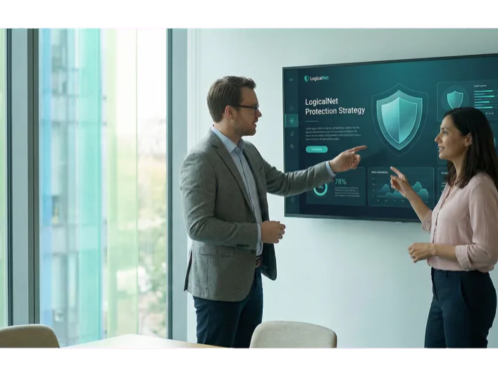
From the region’s first internet provider to the logic behind your network.