Verant Wealth
A new wealth firm that looks as established as the 17 years of trust behind it.

SMHA had been building up Schenectady for years. The community only knew the name, and the old labels that came with it.
We gave them an identity rooted in the city itself: a tulip drawn from Schenectady’s Dutch beginnings, with a home at its heart.
People in Schenectady knew the name. They didn’t know everything behind it.
SMHA’s old mark was a set of colored bars and house shapes. It said “housing” and nothing more, so the public filled in the blanks with the labels they already had: “public housing” and “the projects.”
That story was incomplete. SMHA was investing in development all across Schenectady. The community just couldn’t see it.
In Schenectady, that story was “the projects.” People pictured an agency that managed aging buildings, not one building new homes and stronger neighborhoods.
Every new building and renovation was quietly filed under the same old label, and nothing about the old logo gave anyone a reason to think again.
What are people filling in about you?
So the brand had one job. Say it clearly: We are Schenectady, and we’re helping build its future.
Every choice in the new identity points back to the city, and to the people SMHA serves.
Schenectady was settled by the Dutch in 1661. The tulip nods to that heritage, ties SMHA to the city’s roots, and carries a natural message of growth.
Look closely: the inner petals form the outline of a house. It’s subtle by design. The tulip leads with community and growth; the house quietly reminds you what SMHA builds.
Bright orange and deep navy feel optimistic, approachable and steady. A clean break from the old look, and from the institutional feel people expected.
“SCHENECTADY” carries the wordmark in bold, with “Municipal Housing Authority” beneath it. The city comes first, not the agency.
Drag the handle to see what changed.


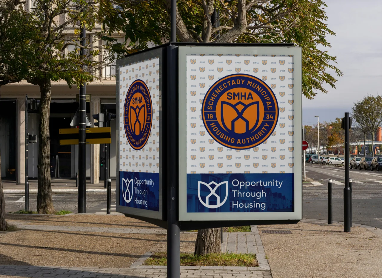
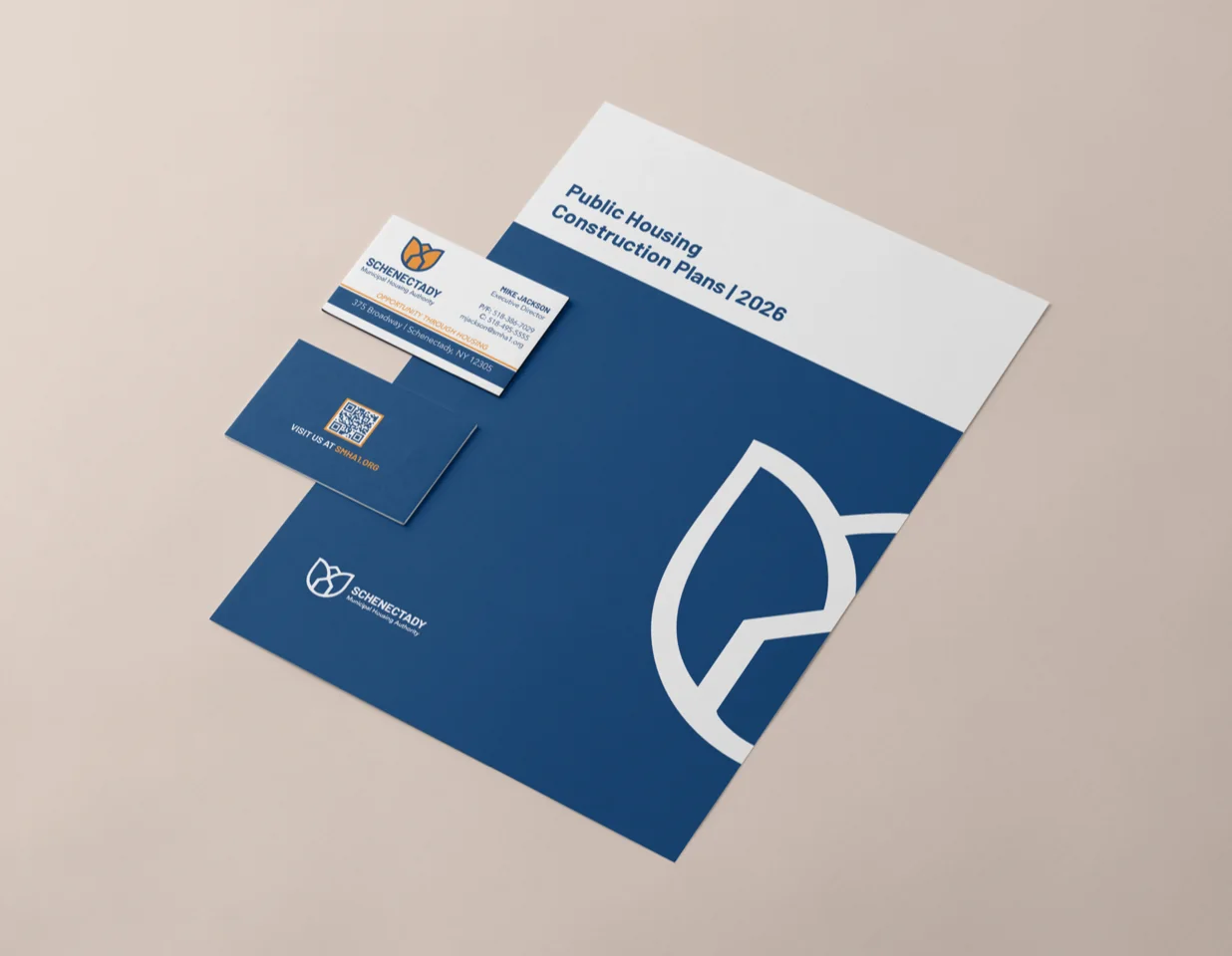
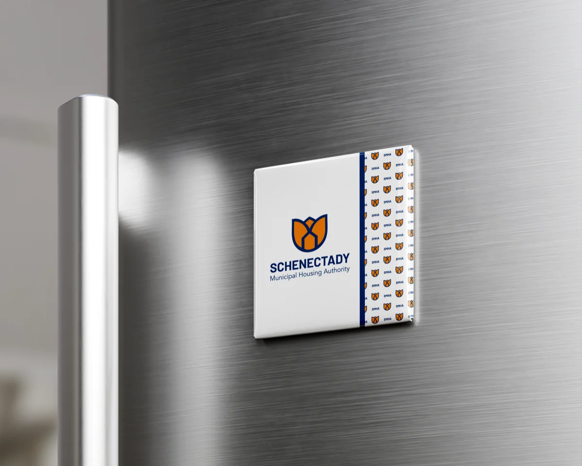
A logo alone doesn’t change minds. A consistent system does: seal, pattern, tagline and color working together on the street, on the desk and on the fridge door.
The new identity doesn’t just look better. It gives people a different first impression of SMHA, and a reason to let go of the old one.
If people still see you the way they did years ago, your brand may be telling an old story. Every engagement starts with a free consultation, where we look at how you’re seen today and what it would take to change that.
Free consultation ● No pressure ● Straight answers

A new wealth firm that looks as established as the 17 years of trust behind it.

From the region’s first internet provider to the logic behind your network.
A crest, four card suits and a line the regulars repeat: Royal Smokes for Royal Folks.