RMB page scripts. Hidden on the live site; keep this widget on the page. Styles come from Site Settings > Custom CSS.

MS360 Momentum Solutions

Two companies. One momentum.

EHS Momentum made safety software for the people doing the work. Vytal Assets helped them keep their equipment running. When the two merged, they needed one name for everything they now do together.

We built MS360 a mark that holds the whole family: a monogram that breaks out of its circle, and a name that says where the business is headed.

Client
MS360 Momentum Solutions
Industry
Safety & operations software
Services
Brand identityLogo design
Palette
Blue #1264C8 · Gray #B0B1B3

Two brands. One company.

A merger doubles what you can offer. It can double the confusion, too.

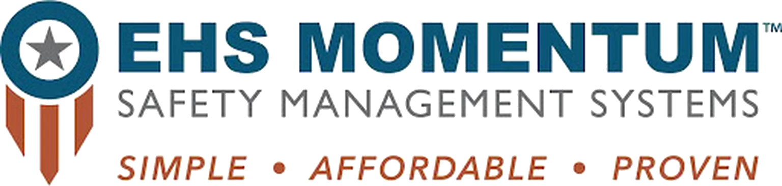
EHS Momentum had built its name on safety software, with a star-and-stripes badge and the promise “Simple. Affordable. Proven.” Vytal Assets had its own name, its own look and its own customers.

Side by side, they still looked like two companies. The new business needed one identity that could sit above safety, maintenance and the products still to come.

The old EHS Momentum logo
Before: the EHS Momentum badge, built for one product rather than a family.

When customers can’t tell what belongs together, they don’t buy the whole thing.

A safety manager who knew EHS Momentum had no reason to look at a maintenance platform with another company’s name on it. Every product was selling on its own.

And the old badge said “safety management systems.” The merged company had grown well beyond that.

Does your brand fit everything you do now?

A merger isn’t two logos side by side. It’s one direction for both.

So the brand is built on the word both companies already shared: Momentum.

Four decisions. One clear story.

Every choice in the new identity points back to what MS360 Momentum Solutions really stands for.

A monogram that breaks the circle

The M and the S push through the edge of the ring: momentum you can see, a business moving past where it started.

A check mark in the M

The middle of the M drops into a check: the sign-off on an inspection, a closed work order, a job done safely.

Software blue, machine gray

A confident blue for the platform, and the gray of steel and concrete where the work actually happens.

A name for the whole picture

“360” covers the full circle: people, assets and the work itself, in one connected family of platforms.

Same company. A different story.

Drag the handle to see what changed.

After: the MS360 Momentum Solutions logo
Before: the EHS Momentum logo, Safety Management Systems

Built for the shop floor.

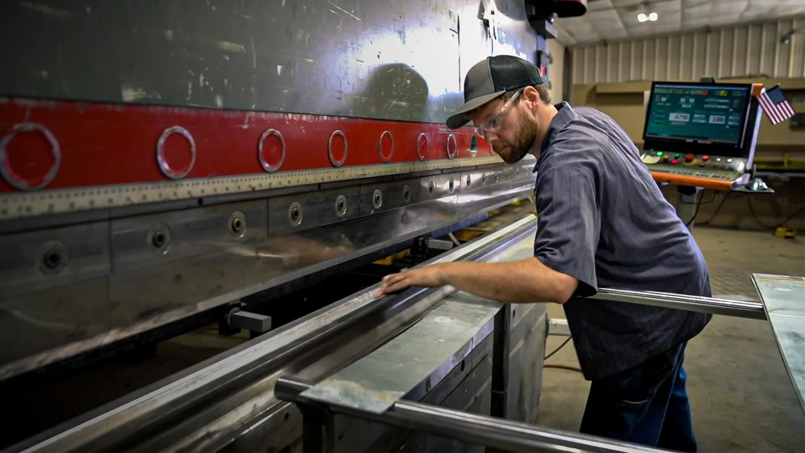
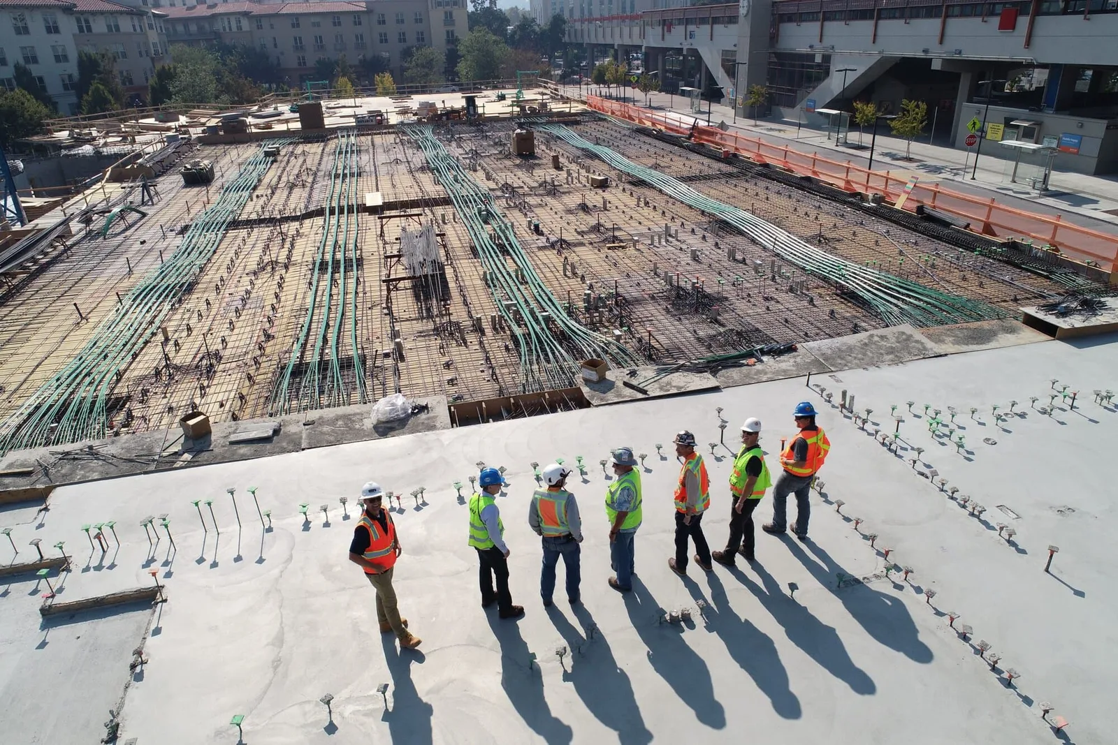
MS360’s customers work in plants, yards and job sites, so the identity has to read on a tablet beside a machine as clearly as on a sales deck.

What changed.

One name now sits above every product, so a customer who trusts one platform can find the rest.

  • Two companies, two logos.One family, one name.
  • Safety management software.Safety, assets and execution.
  • A badge built for one product.A system with room to grow.
  • A merger nobody could see.A brand that reads as momentum.

Does your brand show the work you’re really doing?

If people still see you the way they did years ago, your brand may be telling an old story. Every engagement starts with a free consultation, where we look at how you’re seen today and what it would take to change that.

Free consultation No pressure Straight answers

More work.