RMB page scripts. Hidden on the live site; keep this widget on the page. Styles come from Site Settings > Custom CSS.

Executive Group

The crew behind the finished room.

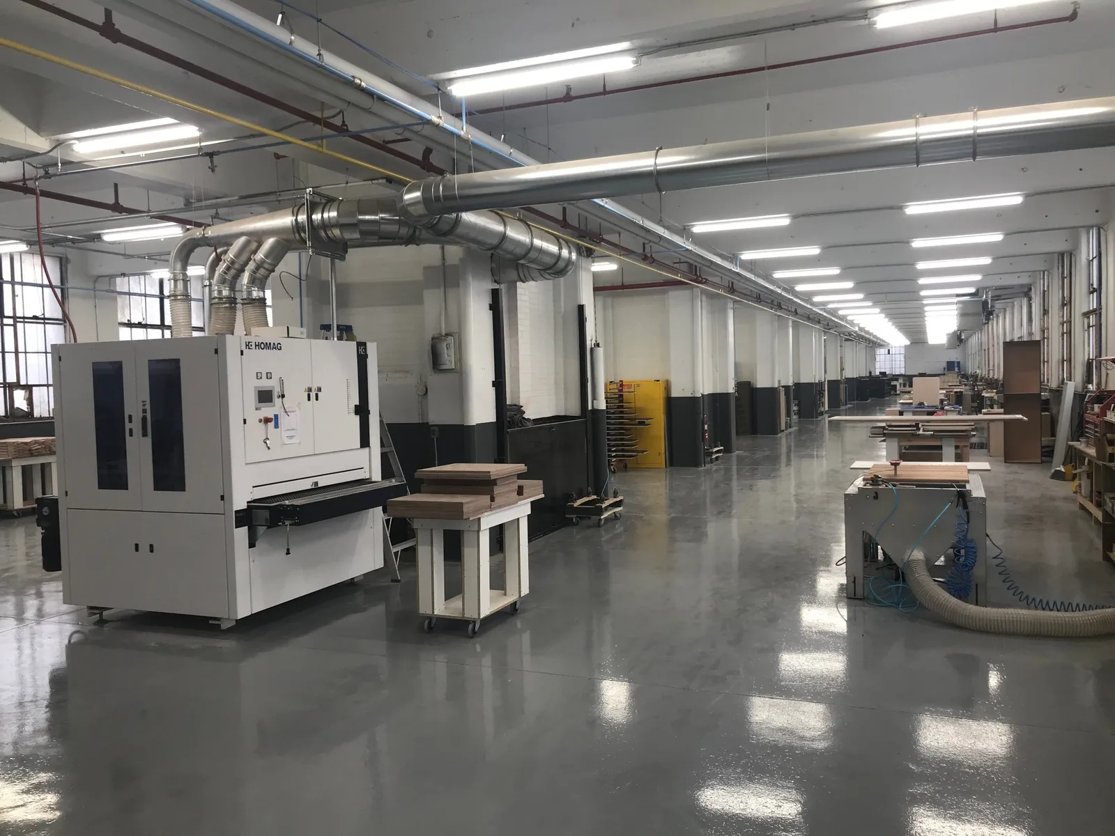
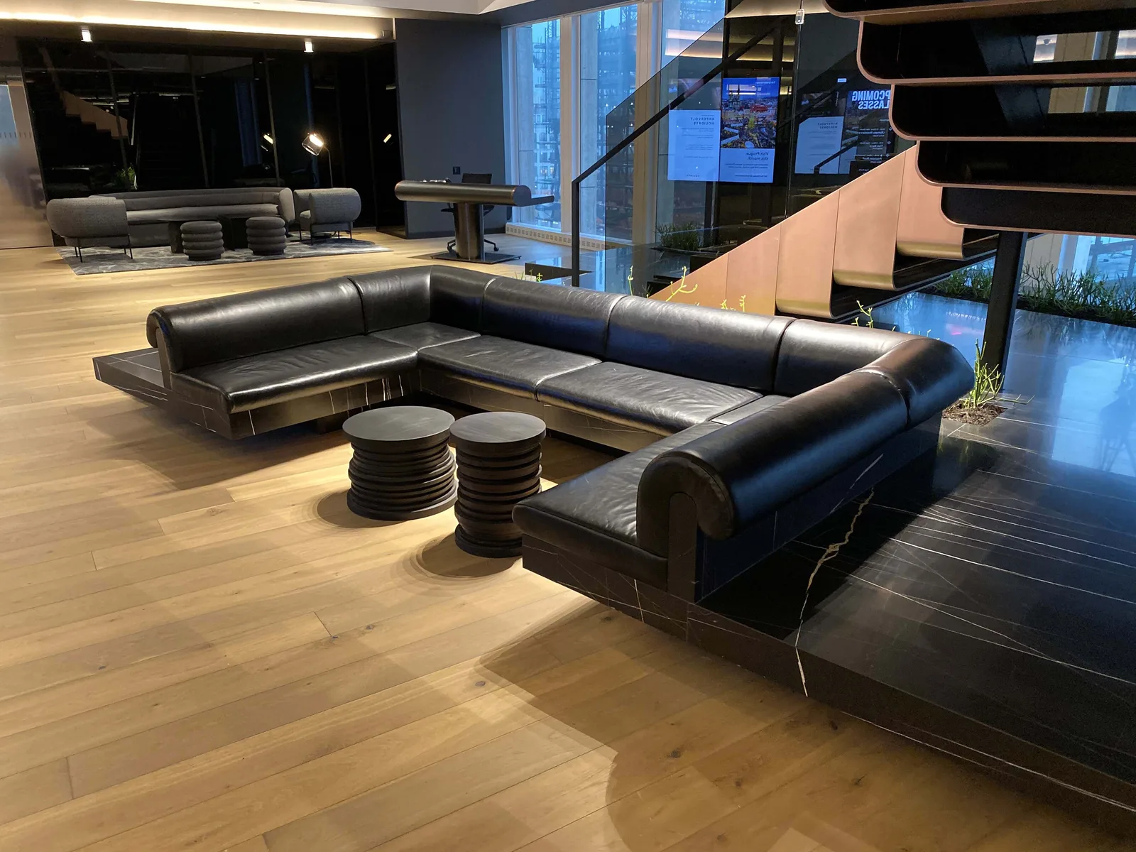
Executive Group furnishes high-end hotels. It stores, delivers and installs everything from the lobby sofas to the guest-room millwork, much of it built in its own shop in Amsterdam, NY.

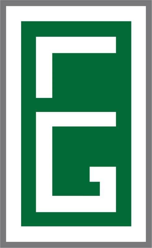
We traded a busy 3D logo for a square, confident monogram that works as hard as the crews do.

Client
Executive Group
Industry
Hotel FF&E, logistics & millwork
Services
Brand identityLogo design
Based in
Amsterdam, NY

Big jobs. A small-business logo.

Executive Group started in 2007 as a two-man crew installing millwork.

By 2019 it had a warehouse, a factory, its own trucks and more than 70 employees on hotel projects in New York and Boston. Its logo was still a shaded 3D cube: hard to read small, and hard to reproduce on a crate, a truck or a hard hat.

Hotel brands, purchasing agents and general contractors trust a partner like this with an entire opening. The brand had to look like a company that could carry one.

The old Executive Group logo: a shaded green 3D cube
Before: a shaded 3D cube, hard to read on a truck door or a shipping label.

In a business built on deadlines, the brand has to look as dependable as the crew.

A hotel opening runs on trust. Every sofa, fixture and headboard has to arrive on time, undamaged and installed right, and clients pick that partner long before the first truck shows up.

A logo that looked like clip art made a company with its own warehouse, factory and installers look smaller than it was.

Does your brand look as big as the jobs you win?

A finished hotel room is straight lines and tight corners. The mark should be built the same way.

Their own promise says it best: Our logistics, your success.

Four decisions. One clear story.

Every choice in the new identity points back to what Executive Group really stands for.

An E and a G, built square

The two letters fold into one solid block, every turn a right angle, like a corner cut and fitted in the shop.

One path through the maze

Follow the white line: it winds from the top of the E to the hook of the G without a break. One route, from the warehouse to the finished room.

Green and steel gray

Executive Group kept its green, deepened it, and paired it with the gray of the warehouse floor and the job site.

Letters with an even step

EXECUTIVE is set in square, evenly spaced capitals, steady as a stack of crates, with GROUP in gray beneath.

Built for the warehouse floor.

The mark has to hold up wherever the work goes: in the Amsterdam shop, on crates and trucks in the warehouse, and in the hotel rooms it all ends up in.

What changed.

The new identity gives Executive Group a mark as solid as its work, and it reads the same on a bid, a crate or a truck.

  • A two-man millwork crew.A full-service FF&E partner.
  • A shaded 3D cube.A flat mark that prints anywhere.
  • Hard to read small.Clear on a label, a truck or a hard hat.
  • One more subcontractor.The team that delivers the finished room.

Does your brand show the work you’re really doing?

If people still see you the way they did years ago, your brand may be telling an old story. Every engagement starts with a free consultation, where we look at how you’re seen today and what it would take to change that.

Free consultation No pressure Straight answers

More work.