RMB page scripts. Hidden on the live site; keep this widget on the page. Styles come from Site Settings > Custom CSS.

LogicalNet

From dial-up pioneer to the logic behind your network.

LogicalNet has kept Upstate New York connected since 1994. As the business grew from internet access into managed IT and cybersecurity, its brand stayed behind, and so did its story.

We helped LogicalNet refocus on what clients really buy today, the people and the thinking behind the technology, and retell that story with a new mark and message.

Client
LogicalNet
Industry
Managed IT & cybersecurity
Services
Brand identityLogo designMessaging
Based in
Schenectady, NY

Known for dial-up. Doing so much more.

People still remembered LogicalNet as an internet service provider.

The old mark said so out loud: a globe, a swoosh and the words “Internet Service Provider.” Meanwhile LogicalNet was running help desks, data centers and around-the-clock security for organizations across the region.

The message was old and stale. It described a business LogicalNet had outgrown, and prospects weren’t signing.

Before: a logo from the dial-up years, still promising internet access.

If your brand describes what you used to do, that’s what people think they’re buying.

Prospects saw a utility: a connection, a line item, something to shop on price. Sales conversations started with the wrong question.

The thing that really set LogicalNet apart, engineers who know your network and pick up the phone, never made it into the first impression.

Does your brand describe what you do today?

Clients don’t hire LogicalNet for the connection. They hire it for the thinking behind it.

So the brand had one job: put the expertise first. The logic behind your network.

Four decisions. One clear story.

Every choice in the new identity points back to what LogicalNet really stands for.

A brain built like a network

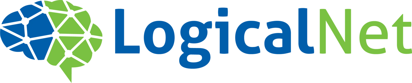
Every node and line in the mark is a connection, and together they form a brain: the expertise that designs, watches and fixes the network.

A line that does the selling

Six words tell a prospect what they’re really paying for: judgment and experience, not just hardware and bandwidth.

Two colors, two halves

Steady blue for the infrastructure clients rely on, bright green for the thinking that keeps it growing. The wordmark splits the same way: Logical, Net.

A mark that talks back

The brain ends in the tail of a speech bubble: a quiet promise that you’ll reach a person who explains things plainly.

Same company. A different story.

Drag the handle to see what changed.

After: the LogicalNet brain mark beside the blue and green wordmark
Before: the old LogicalNet globe logo, Internet Service Provider

A story worth telling on air.

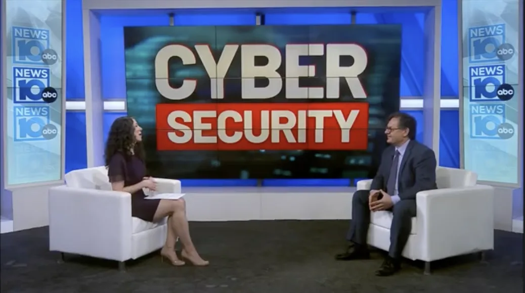
With a clear story to tell, LogicalNet tells it in public: on the evening news, online, and at the Tech Valley Cybersecurity Symposium it has hosted since 2022.

What changed.

The new identity gives prospects a different first impression of LogicalNet, and a reason to let go of the old one.

  • An internet service provider.A managed IT and cybersecurity partner.
  • A utility you shop on price.Engineers who know your network.
  • A logo from the dial-up years.A mark built from connections.
  • “Who do we even call?”One number, and a person who answers.

Does your brand show the work you’re really doing?

If people still see you the way they did years ago, your brand may be telling an old story. Every engagement starts with a free consultation, where we look at how you’re seen today and what it would take to change that.

Free consultation No pressure Straight answers

More work.